Punk is not dead
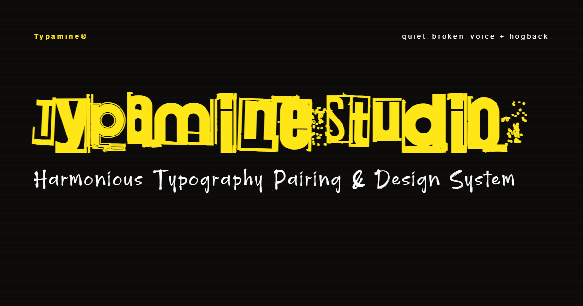
This typographic pairing captures the raw, DIY energy of the 1980s underground punk and indie scenes, relying on striking contrast and high visual noise. Primary Font (Quiet Broken Voice): Used for main titles and bold visual anchors. Its distressed, fractured aesthetic mimics classic hand-copied zines, screen-printed gig posters, and photocopied flyers. Secondary Font (Hogback): Used for subheaders, event details, date, and venue information. Its stark, utilitarian form provides clean readability while keeping an edge that complements the main title. We suggest adopting a high-contrast yellow and black color scheme to channel the raw, rebellious energy of 1980s underground poster art. A sharp yellow backdrop punched through with heavy black typography instantly evokes warning signs, street flyers, and DIY zines. For a concrete cultural anchor, think of the classic yellow stitching contrasting against the black leather of Dr. Martens—a timeless, unmistakable symbol of 1980s alternative counterculture that perfectly grounds this visual identity.
quiet broken voice
CREATOR: Juha Korhonen
AaBbCcDdEeFf 123