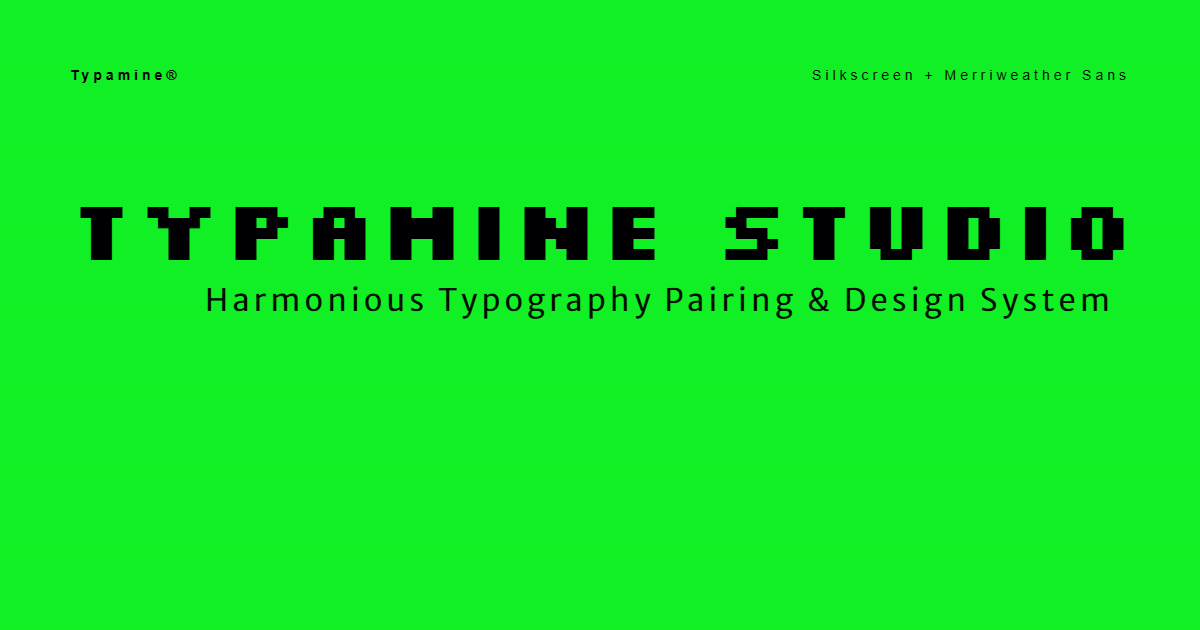
Merriweather Sans
CREATOR: Eben Sorkin
AaBbCcDdEeFf 123
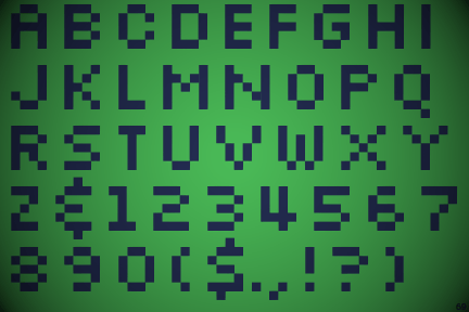
Designed by Jason Kottke in 1999, Silkscreen is the undisputed king of pixel fonts—and a masterclass in functional design constraints. Designed specifically around an 8X8 pixel grid to stay razor-sharp at microscopic sizes during the early web era, it strips typography down to its absolute essentials without losing its personality. What makes Silkscreen so timeless isn’t just nostalgic Y2K nostalgia or its retro 8-bit charm; it’s the sheer ingenuity of its readability. Whether it’s anchoring a subtle UI micro-label, adding tactical grit to a modern tech interface, or giving a digital packaging design that perfect utilitarian edge, Silkscreen proves that true typographic precision never goes out of style.
To keep creative pairings grounded and effortless to navigate, Merriweather Sans steps in as the ultimate functional anchor. While high-concept or retro display fonts bring personality to the foreground, Merriweather Sans quietly delivers clean, ultra-readable body text and structural clarity across any screen. It provides the essential typographic equilibrium that allows bold, expressive titles to shine without compromising usability. The result in pairings like this is a dynamic visual dialogue—where playful, stylized display type meets unshakeable digital utility, proving that distinct creative character and sharp everyday readability can coexist seamlessly.
Designing a pixel font is a game of compromise. You only have a tiny, rigid grid of pixels, and every single dot counts. You're not drawing shapes; you're solving a puzzle
Jason Kottke
9/27/1973 - Now•blogger, graphic designer, web designer