Beyond the Flame: Decoding Tinder’s First Rebrand in a Decade
Our analysis of why it matters for modern tech brands.
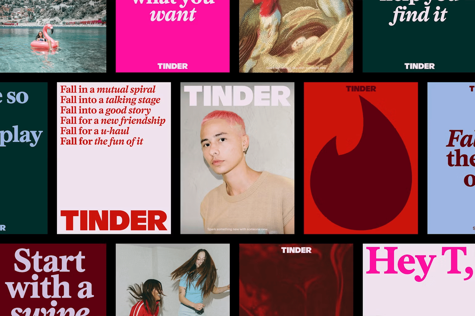
Tinder recently unveiled its first major brand overhaul in nearly ten years, designed alongside the renowned agency Porto Rocha. On the surface, it’s a sleek facelift—an all-caps logo, a refined flame, and a sophisticated serif font. Beneath it, it’s a masterclass in how modern platforms use visual language, motion systems, and brand voice to fix real business challenges.
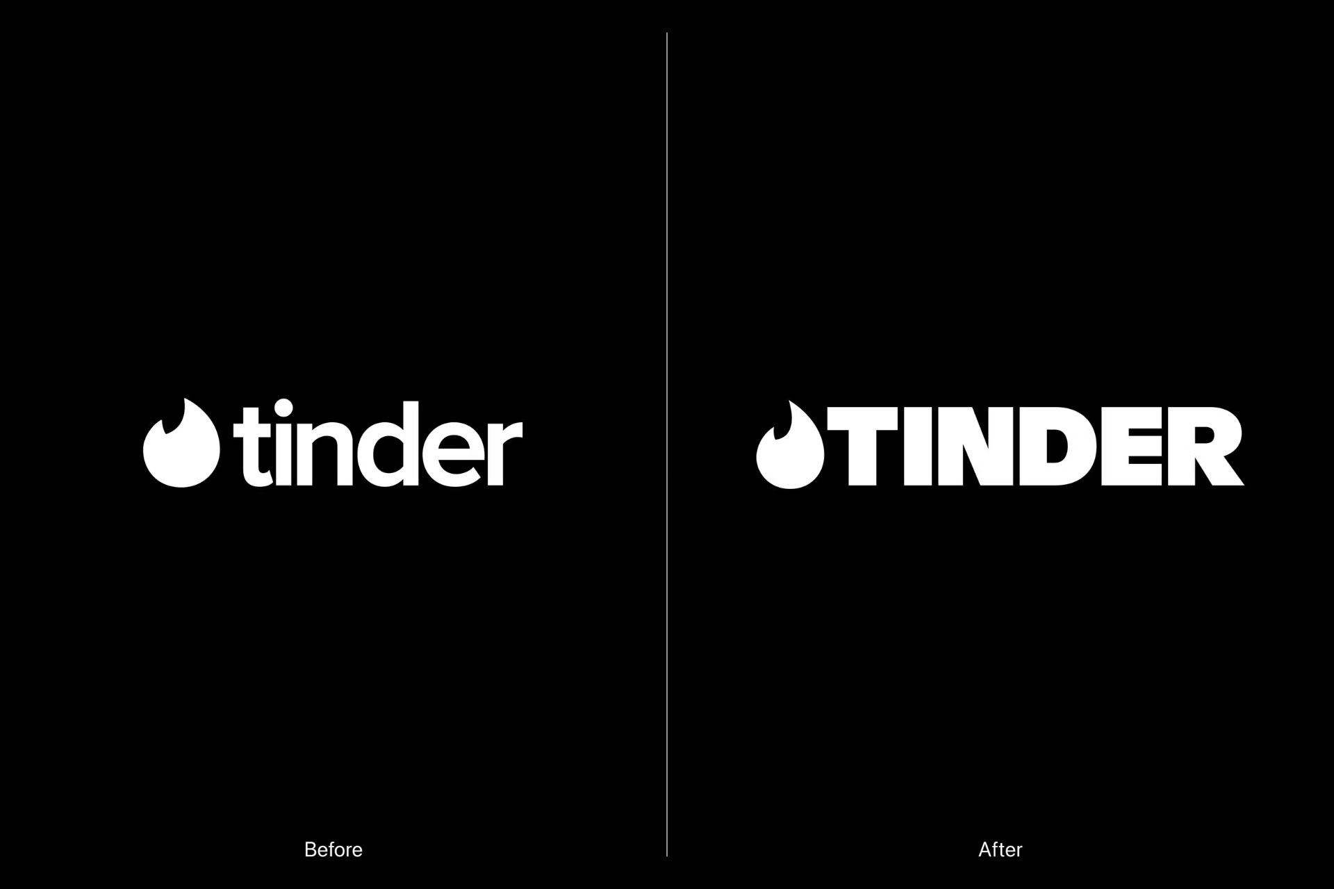
A consumer brand of Tinder’s scale rarely rebuilds its identity without a critical strategic reason. Moving away from its historic lowercase wordmark, the new all-caps TINDER logo trades a soft, casual aesthetic for an assertive, confident posture. The iconic flame—the app’s most valuable visual asset—was sharpened rather than replaced, proving that smart rebrands protect brand recognition while evolving everything around it. The most unexpected addition to a mobile-first UI is a luxurious serif typeface. While tech platforms typically default to safe, sterile sans-serifs, Tinder introduces editorial typography to evoke the nostalgic feel of classic print magazine columns.
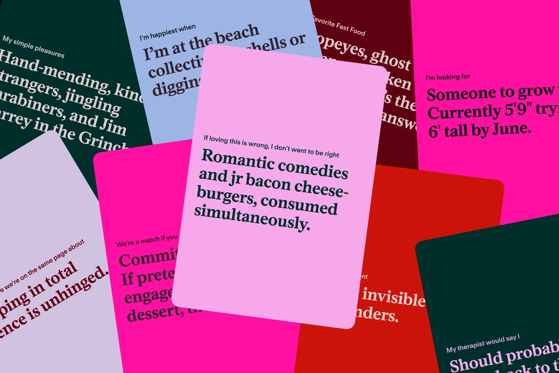
Beyond typography, the visual overhaul introduces a major expansion to Tinder's iconic color identity. While the signature red-to-pink gradient remains the primary anchor, the brand introduced vibrant blues, greens, and secondary neutral hues to represent the chaotic, multi-faceted nature of modern dating. This expanded color system works hand-in-hand with refined UI micro-interactions. Haptic feedback, subtle animations when buttons are tapped, and fluid visual transitions now make every action within the app feel intentional rather than repetitive. Micro-interactions are no longer just functional UI cues; they serve as a dynamic extension of the brand identity, giving users immediate visual gratification and making digital interactions feel tangible and responsive.
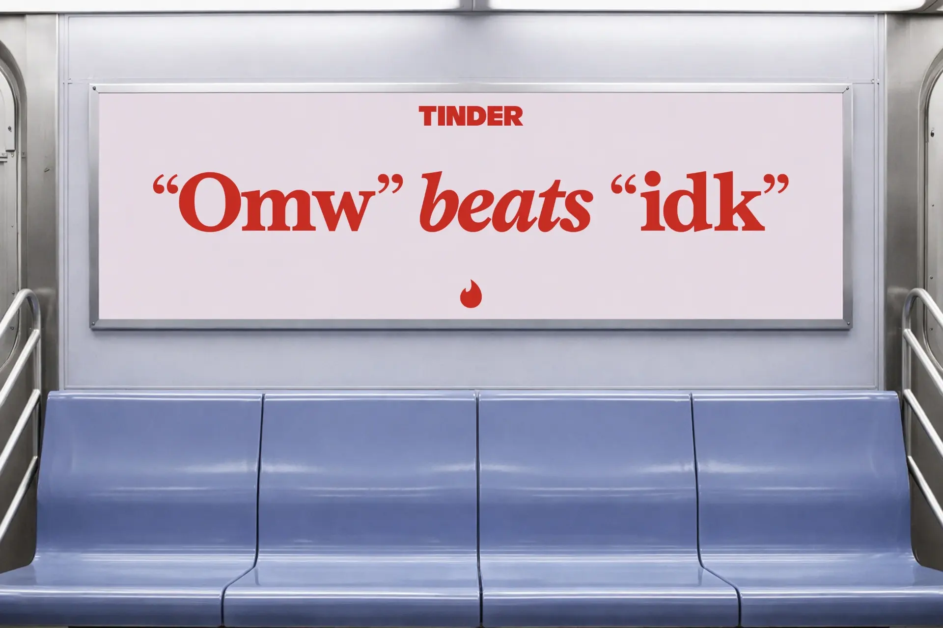

The swipe gesture is Tinder’s signature product interaction, but Porto Rocha took it further by turning a functional UX mechanic into a comprehensive motion-design system. The swipe movement now structures advertising layouts, reveals typography, and frames social media content. "A system is worth infinitely more than an isolated logo. The most solid contribution of this rebrand isn't the reworked flame, but the motion framework that stems from a core product behavior." By turning product behavior into a brand device, Tinder demonstrates how digital-native companies can achieve visual consistency across marketing channels without relying solely on static logos.

Visual changes are only half the battle; tone of voice does the heavy lifting. Tinder introduced "T", a fictional dating columnist inspired by iconic figures like Carrie Bradshaw and 90s advice columns. "T" serves as the editorial anchor, replacing outdated fairy-tale tropes like "happily ever after" with an open-ended "happily TBD." This shift directly addresses a Gen Z audience that approaches dating with less rigid, goal-driven expectations and more desire for fluid, multi-faceted connections—whether that means a crush, a slow burn, or just a tennis partner.

Details are not the details. They make the design.

Charles Eames
June 17, 1907 – August 21, 1978•American designer, architect and filmmaker

Written by Roberto Barbagallo
July 25, 2026