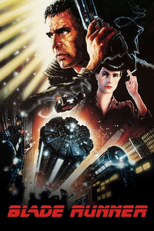
Neon & Gridlines: The Typographic Legacy of Blade Runner (1982)
How Ridley Scott’s sci-fi masterpiece created the universal visual shorthand for cyberpunk dystopia.

Filed by Roberto Barbagallo
July 24, 2026
How did the typography of a 1982 film come to define our visual shorthand for the future? In "Neon & Gridlines," we analyze how Ridley Scott and his creative team fused modernist typography, Japanese neon signage, and analog UI to forge the universal graphic language of cyberpunk dystopia.
The typographic landscape of Blade Runner wasn't created in a vacuum; it emerged from the breakdown of mid-century modernist design principles. Where European Modernism sought clarity, order, and functional purity—best embodied by clean, geometric sans-serifs like Helvetica or Futura—Ridley Scott’s 2019 Los Angeles takes that precision and corrupts it with unchecked consumerism. The monumental typography of the film's ruling megacorporations, starting with the stylized Tyrell Corporation logo, projects a cold, monolithic authority. These industrial sans-serifs no longer signal human progress; instead, they communicate social control and the oppressive footprint of corporate dominance.
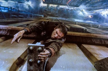
While corporate geometry reigns over the upper towers, street level is a chaotic, sensory-overload babel of typography, light, and cultural layering. The juxtaposition of Japanese Kanji alongside oversaturated Western neon lettering creates a distinct visual noise where signage is no longer just informational—it becomes the architecture itself. Light cuts through the endless rain and urban smog, turning typography into the primary source of atmosphere. This graphic fragmentation reflects a multicultural, crumbling metropolis where languages collide on damp walls, establishing the definitive visual shorthand adopted by every cyberpunk title that followed, from Ghost in the Shell to Cyberpunk 2077.
Beyond billboards and storefronts, Blade Runner laid the foundation for sci-fi motion graphics through its analog user interfaces. The monitors of the Voight-Kampff machine and the in-vehicle displays of the Spinner rely on strict vector grids, dense monospaced typography, and phosphor green or amber CRT readouts. This aesthetic—defined by scanlines, high-density data readouts, and rigid layouts—shaped our collective perception of "advanced yet tangible" technology. This is the typography of the gridline: ruthless, utilitarian, and completely dehumanized, reminding the viewer that the machine is constantly reducing humanity down to pure raw data.